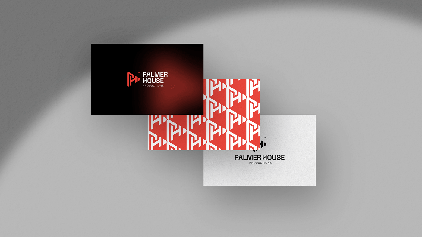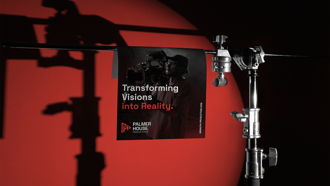

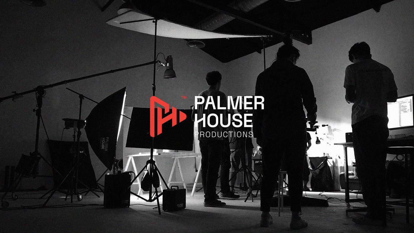

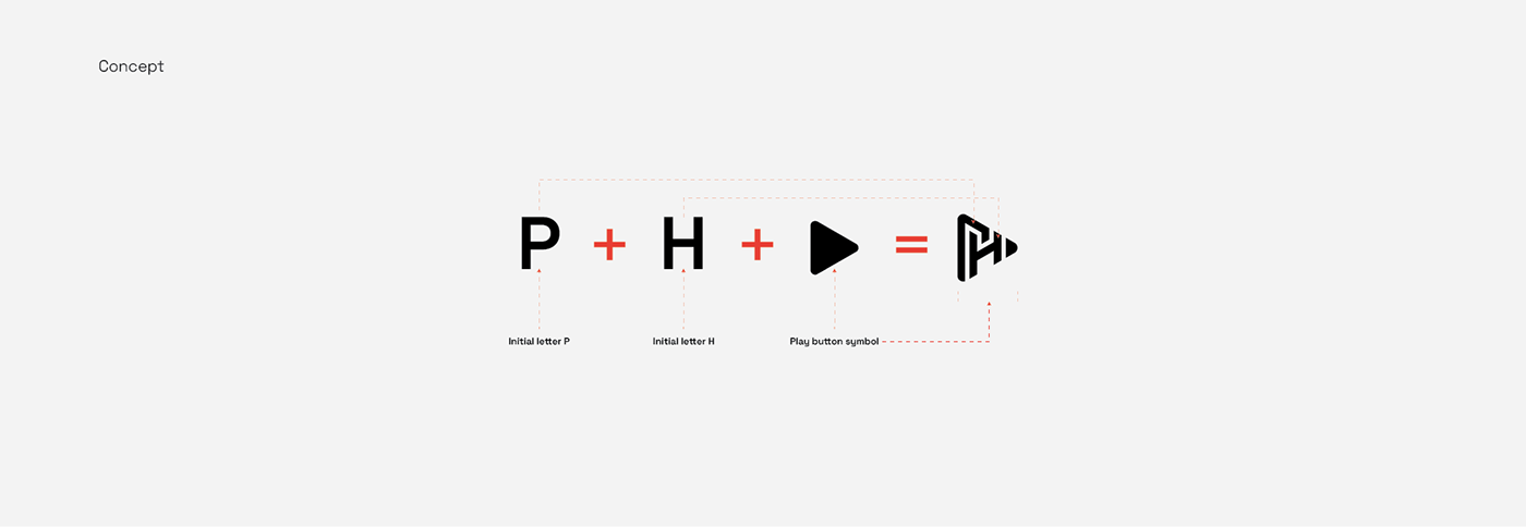
The Palmer House Production logo is a brilliant representation of the brand's expertise in video production and editing. The clever fusion of the letters "P" and "H" forms a distinctive play button. The incorporation of a play button within the logo is a powerful visual cue, emphasizing the brand's core competence in delivering captivating multimedia experiences.
The clean and minimalist design ensures easy recognition and recall, making it a memorable emblem in the minds of the target audience.
In summary, the Palmer House Production logo is a masterfully crafted symbol that encapsulates the essence of the brand—a perfect blend of creativity, professionalism, simplicity, and a commitment to delivering compelling video content.

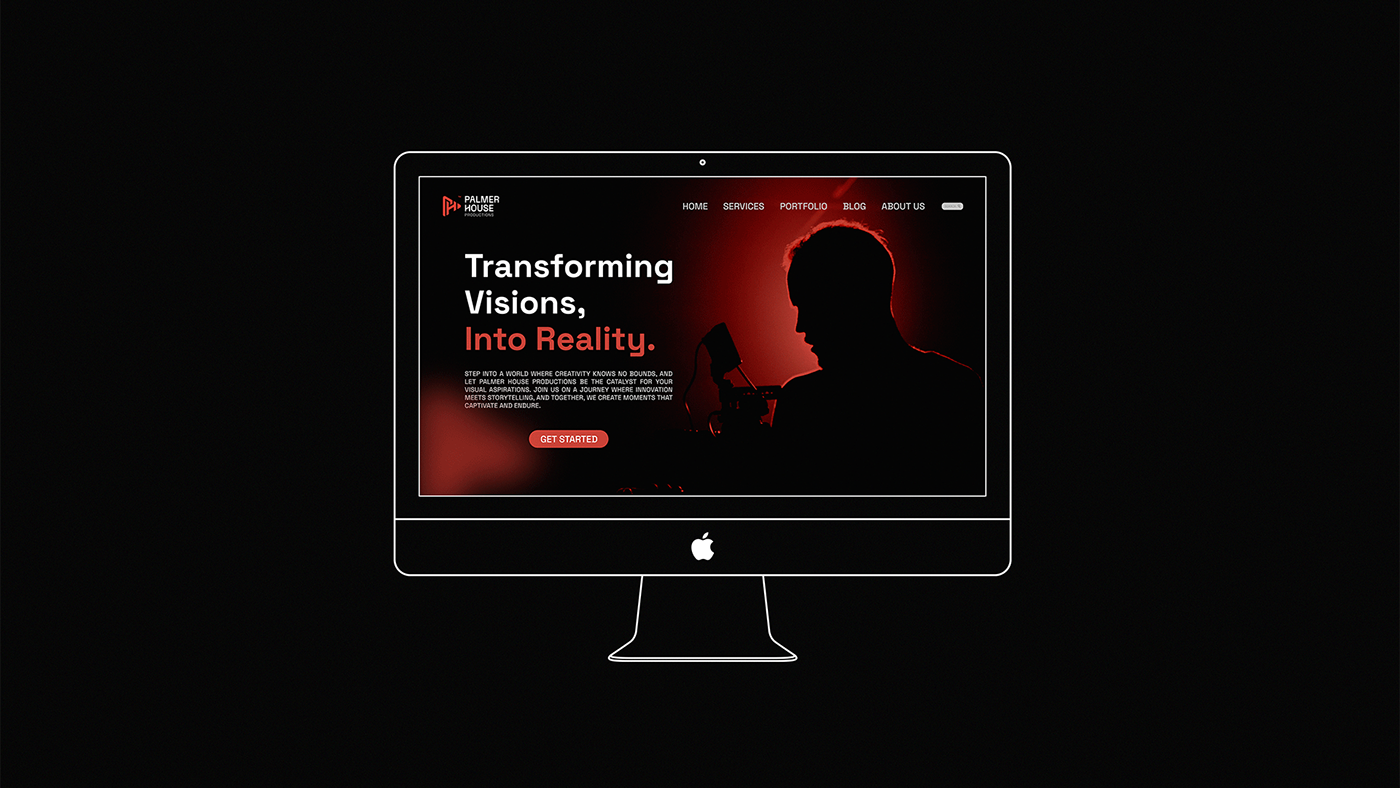
The logotype's modern aesthetic aligns with contemporary design trends, reflecting Palmer House Production as a forward-thinking and innovative media production company.
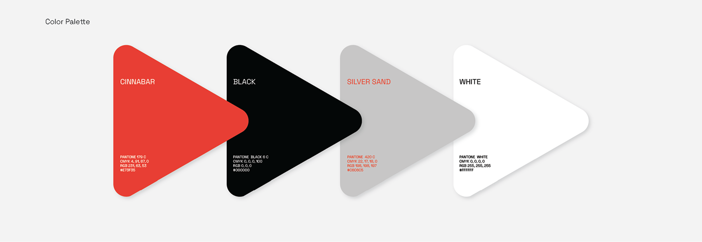
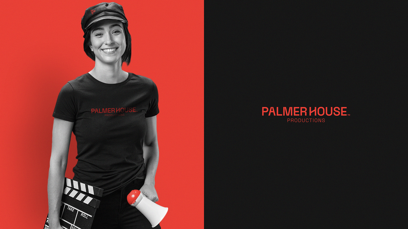
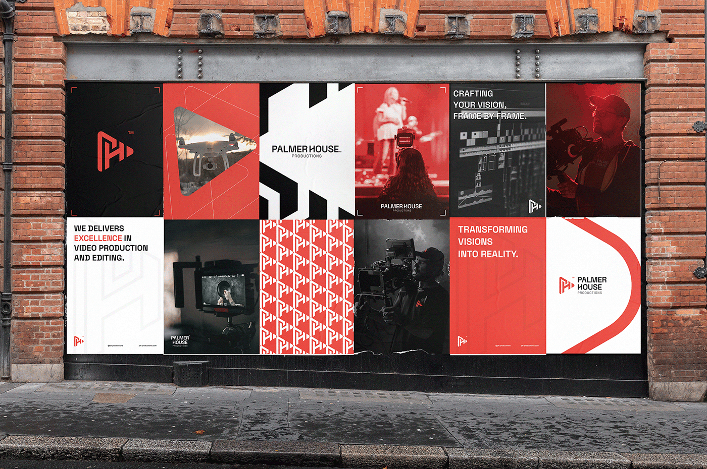
The choice of colors in the Palmer House Production logo holds strategic significance. Cinnabar red symbolizes passion and creativity, capturing the brand's dynamic video production. Black conveys sophistication and timelessness, reflecting professionalism. Silver sand adds a touch of modernity and innovation. White represents purity, emphasizing the brand's commitment to high-quality video editing.

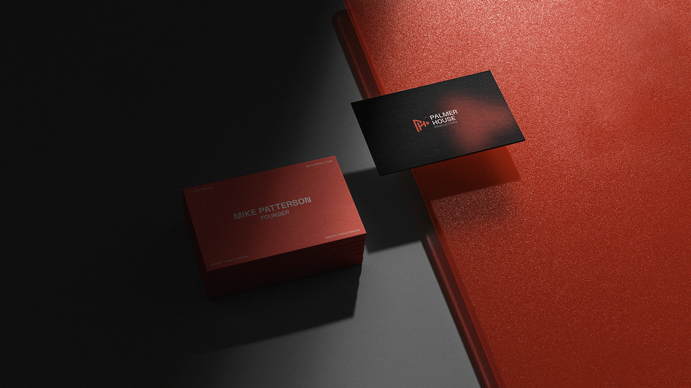
The logo's versatility allows for easy application across various brand materials, from digital platforms to print media.